Why the Military (Still) Can’t Quit PowerPoint
Reading Time: 9 minutesAt least the memes are good., Military PowerPoint memes: Colin Powell’s speech at the UN was only the beginning.
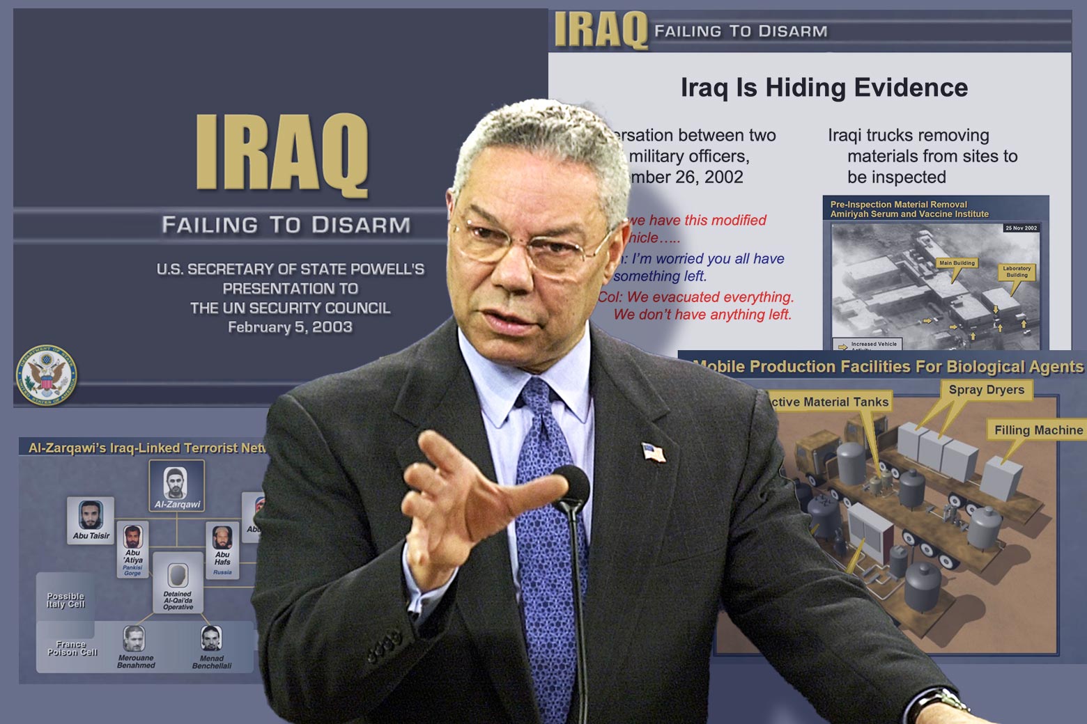
This past Sunday marked 20 years since then-Secretary of State Colin Powell delivered his remarks to the U.N. Security Council laying out the evidence for the existence of Saddam Hussein’s ‘weapons of mass destruction.’ The episode is now infamous, but probably few remember the PowerPoint slides Powell used to add gravitas to his presentation, which was titled ‘Iraq: Failing to Disarm.’ Aided by the ubiquitous slideshow software, Powell performed his sleight of hand to justify the impending U.S. invasion. ‘As Mr. Powell’s presentation unfolded with its layers of allegations and counter-allegations, its satellite photography and banal conversations between apparatchiks of Saddam’s oppressive security apparatus,’ the Guardian reported at the time, ‘his chosen vehicle to deliver what was supposed to … convince the waverers and doubters on the security council was none other than PowerPoint.’ Powell’s slides included a title card, bulleted lists, and diagrams—all the .ppt trappings we have come to know and (usually) despise. It was a pitch deck selling a war.
Powell was far from the first or the last defense official to wield PowerPoint slides for militaristic ends. PowerPoint has become so ingrained in U.S. military culture that phrases like ‘death by PowerPoint’ are commonly understood by anyone who has sat through an interminable Pentagon briefing. In a 2021 essay for the New Yorker, historian Jill Lepore chronicled how businesses have adopted military culture; for example, in the 1970s business guru Peter Drucker urged businesses to draft ‘mission statements,’ a term adopted from the Joint Chiefs of Staff in the Vietnam War, as part of their ‘strategic planning,’ another mainstay of military language. But this is a two-way street: The military has also adopted business culture. How did this benign corporate software become the Pentagon’s weapon of choice, equally at home in the boardroom and the war room?
Released in 1987, PowerPoint added flashy computerized flair to the overhead-projector presentation. Its accessibility and preinstallation on personal computers using the Microsoft operating system led to a quick uptake across organizations of all stripes, but PowerPoint found a natural home in the U.S. military—a bureaucratic, hierarchical institution with a culture accustomed to briefing superiors up the chain of command. ‘These slides are principally made because briefings are so integral to U.S. military culture, and PowerPoint emerged as a really easy way to create the visual component that was a smaller part of briefings historically—the map, the chart, the graph, the list,’ said Elspeth Van Veeren, a professor at the University of Bristol and an expert in U.S. security cultures and policies. ‘Just like in other settings, like the business world and education, it has become the expected standard. If you give a talk, you should have visuals—and usually PowerPoint.’
By 2000, PowerPoint already had such a high rate of usage in the U.S. military that Gen. Hugh Shelton, who was then chairman of the joint chiefs, issued a militarywide order to cut down on the visual bells and whistles in PowerPoint presentations. Not only were they distracting from the content of the briefings, the bandwidth being used for spinning pie charts and zooming tank icons was slowing the DOD’s servers. ‘There is an arms-race dimension to it,’ Peter Feaver, a military expert at Duke University, told the Wall Street Journal at the time. ‘If there are three briefings in a row, and you are the one with the lowest production values, you look really lame.’
This obsession with distracting visuals was not unique to the PowerPoint era. During World War II, Gen. Clayton Bissell, George Marshall’s chief intelligence officer, was notorious for an insatiable appetite for visual aids, which had grown so large that a ‘special truck’ carried the colorful maps and charts required at his morning meetings. But the advent of PowerPoint only exacerbated these tendencies, enabling the production of briefing visuals on a scale beyond Bissell’s wildest dreams.
As anyone serving in the military can likely attest, Gen. Shelton’s early-2000s directive did little to keep the slides at bay. Active service members and veterans know these strange visuals all too well. Any organization the size of the U.S. military will inevitably claim several superlatives: largest employer in the world, single largest institutional producer of greenhouse gases in the world, and world’s largest landlord. But one more distinction deserves a spot on the list: most prolific creator of bizarre, indecipherable infographics.
Since Powell’s time, these infographics have become great fodder for internet jokes. In 2021, James Clark, writing for Task & Purpose, pondered an infographic titled ‘The Integrated Survivability ‘Onion,’ ‘ pulled from a PowerPoint slide made by the U.S. Army’s Combat Capabilities Development Command center. Clark, a Marine veteran, remarked on ‘the military’s ability to transform anything—even something as gripping as ‘don’t be killed’—into a mind-numbing pixelated JPEG.’ The chart, Clark noted, looked so baffling that someone created a KnowYourMeme page for it under the category ‘Science Diagrams That Look Like Shitposts.’
But for other service members, ‘death by PowerPoint’ is no laughing matter. ‘PowerPoint makes us stupid,’ Gen. James Mattis told the New York Times in 2010. One major with over 18 years of military service wrote in Small Wars Journal in 2012 about the ‘exhausting and high-maintenance requirement to churn out repetitive and non-explanatory slide decks for nearly every conceivable information requirement.’ When asked how he spent most of his time while deployed in Iraq, one Army platoon leader responded (seriously): ‘Making PowerPoint slides.’ Statements from everyone from top brass down to the rank and file reveal a damning consensus that PowerPoint kills critical thinking and wastes precious time.
Perhaps the most scathing broadside came from Col. T.X. Hammes in his 2009 essay for the Armed Forces Journal, ‘Dumb-Dumb Bullets.’ For Hammes, PowerPoint was ‘the antithesis of thinking,’ a tool that is ‘actively hostile to thoughtful decision-making.’ Time wasted on complex infographics and font choice is bad enough, but most sinister for Hammes was the use of bullet points, which reduce complex issues to ‘half-formed thoughts.’ These half-formed thoughts clutter slides, which attempt to portray a mind-numbing amount of information coherently. Hammes once counted 90 pieces of information on one slide. Such sins would be unsurprising to Edward Tufte, a Yale professor, information design expert, and famed PowerPoint opponent who once wrote, ‘Power corrupts. PowerPoint corrupts absolutely.’
Meditations on the PowerPointification of the armed forces have not remained solely in the military sphere. Over the years, certain slides have gone public and invited a kind of morbid fascination. Usually when they hit the civilian world, it’s for comical reasons, as with the ‘Integrated Survivability Onion’ chart, or this graphic shared on Twitter by a defense reporter, which looks like a lo-fi nightmare of a ‘Where’s Waldo’–style wimmelbilder.
It’s easy to see why these go viral so often. The slides are dopey, overcrowded products of a dated medium, used by an organization that’s supposedly at the cutting edge of technology and research. In 2018, the Internet Archive held a live ‘karaoke’ event called ‘Battle Decks’ in which comedians and artists improvised a briefing in front of military PowerPoint presentations they had never seen before to celebrate the archive’s collection of nearly 60,000 files scraped from .mil web domains. In a video from the event, the first presenter stands before a title slide that reads ‘Over the KM Horizon,’ written across a rainbow, above the words ‘On the Path to Intelligent Behavior.’ As she ad-libs the meaning, the host advances to the next slide, which immediately elicits laughter from the crowd. She almost doesn’t have to say anything: The slide is the joke.
In 2020, longtime military graphics collector Tim Hwang launched a Twitter account, @DefenseCharts, a feed ‘dedicated to the presentational aesthetics of the defense-industrial complex.’ It’s an endless scroll of maximalist geometry, dizzying causal webs, and WordArt. Browse long enough at the jumble of fonts and lines and you may start to dissociate. Initially a pandemic project, the feed quickly gained followers, who now number over 28,000. In the replies, members of this mixed civilian and military audience are all in on the joke, gleefully picking apart these design travesties.
Beyond the comical, there are darker reasons these military PowerPoints go viral. In 2014, writer Paul Ford summed up the uncanny feeling conjured by the slides. ‘Part of what makes military diagrams so fascinating is that they look a lot like the images civilians use to do their regular workaday jobs,’ he wrote. ‘Also, there is a foundational fact that applies to each image: No matter how abstract they are, these pictures describe systems that the U.S. military uses to make optimal, efficient decisions about killing other humans.’ This was another reason that Hwang started @DefenseCharts. ‘I was immediately struck by the fact that decision-making at the military was essentially being done by PowerPoint slide,’ he said in an interview.
When some of the more absurd PowerPoint slides get the spotlight, they can also generate important and long overdue political debates. After NBC’s Richard Engel made the ‘Afghanistan Stability/COIN Dynamics–Security’ chart public in late 2009, the media lambasted it and the Pentagon consultants who produced it. (This graphic is also the one that inspired Hwang to begin collecting images.) The chart ostensibly depicted the complex causal mechanisms fueling the insurgency in Afghanistan at the time in order to inform the military’s counterinsurgency (COIN) efforts. To some, the graphic was an honest attempt to bring order to chaos, but to most, the graphic looked like spaghetti, a visual representation of the quagmire the country already knew it was in.
At a briefing at the time, Gen. Stanley McChrystal, who was then the leader of American and NATO forces in Afghanistan, quipped, ‘When we understand that slide, we’ll have won the war.’ It’s probably safe to say McChrystal never figured out the slide, one that ‘indicates a bureaucracy that assumes most everything about war can be knowable and related, but endures as a symbol because it’s an unintelligible mess,’ said military technology journalist Kelsey D. Atherton in an interview. ‘It reflects the war it was built to guide.’
For their part, the contractors who made the graphic, PA Consulting, defended their work. In May 2010, PA Consulting’s Executive Chairman Jon Moynihan wrote a letter to the Times of London, which had published an article called ‘The Afghan Situation Explained … Or Not, Depending on Your Opinion of PowerPoint.’ While conceding that ‘thoughtless use of PowerPoint is pervasive and corrosive,’ Moynihan claimed that the chart was taken out of context, and represented ‘a well-known technique—system dynamics—to review a highly complex situation.’
A few months after PA Consulting defended its chaotic slide, Special Forces officer Col. Lawrence Sellin wrote an essay for United Press International raging against the ‘endless tinkering with PowerPoint slides to conform with the idiosyncrasies of cognitively challenged generals in order to spoon-feed them information.’ He was fired just two days later.
Sellin is long gone, and yet the maligned and ridiculed PowerPoint has remained in the military. This could be because some see its shortcomings as assets. In explaining the ‘Afghanistan Stability/COIN Dynamics–Security’ chart, senior military officers told the Times that the software comes in handy when the goal is not to impart information. Such briefings are known as ‘hypnotizing chickens.’ These obfuscation tactics are particularly handy for making the case to a fatigued public that a war is winnable and worth continuing.
However, there are other, less malicious explanations as well. ‘I honestly don’t think any of it was intended to obscure,’ said Jennifer Taw, a professor of international relations at Claremont McKenna College and former RAND analyst who has often been tasked with creating similar slides in the past. ‘In fact, I think it was usually intended to create a visual, intuitive simplification for extremely complex systems.’ Visually, this can result in ‘simplification to the point of abstraction.’
When junior officers and consultants are asked to represent abstract concepts like ‘battlefield awareness’ and ‘counterinsurgency’ on a PowerPoint slide, things can get pretty messy. ‘I think these presentations are like this because they are produced and used entirely by an ingroup, which consists mostly of PowerPoint-reading and -producing officers and their staff,’ said Atherton. ‘The visual style is such that the chart itself becomes a proof of legibility.’ Viewing the slides through the lens of an art critic rather than journalist, Hwang makes sense of the PowerPoints in a similar way. ‘It’s a form of folk art, an aesthetic tradition passed through the bowels of the bureaucracy of the Pentagon,’ said Hwang. ‘It’s a way of expressing—an outsider art.’ For Taw, there’s utility in creating ‘symbols that will feel familiar, create trust, affirm community, and make immediate sense as shared language.’
There are also more structural reasons for the persistence of PowerPoint in military culture, far outside the control of any one junior officer. Some of these reasons are mundane: the inertia of legacy systems, long-horizon contracts, and slow procurement processes. Others get to the very heart of the military’s role in society. For Atherton, PowerPoints suggest ‘an insular language between people whose only questions about the wars they are asked to fight are primarily technical.’ Taw’s experiences making some of these slides bear this out. ‘We elided political questions over which the military has no control and where, honestly, the biggest problems lie,’ she said. ‘We also worked with the assumption that the military must be able to do whatever is asked of it, which contributes, in a circular way, to the military being asked to do everything.’
Whatever the reason, there’s still something unsettling about these slides. When I asked Hwang what his favorite graphic in the @DefenseCharts library was, he sent me this one without hesitation. The graphic contains a generic-looking machine at the center of a diagram with ‘Micro-Electro Mechanical Systems Inertial Sensors,’ ‘Compact, Lightweight Optics,’ ‘Focal Plane Algorithms,’ and other components labeled. And at the bottom, in yellow font against a blue background: Kill Everything.
As former prime minister of France Georges Clemenceau once said, ‘War is too important to be left to the generals.’ Perhaps it’s also too important to be left to PowerPoint, either.
Reference: https://slate.com/technology/2023/02/military-powerpoint-memes-colin-powell.html
Ref: slate
MediaDownloader.net -> Free Online Video Downloader, Download Any Video From YouTube, VK, Vimeo, Twitter, Twitch, Tumblr, Tiktok, Telegram, TED, Streamable, Soundcloud, Snapchat, Share, Rumble, Reddit, PuhuTV, Pinterest, Periscope, Ok.ru, MxTakatak, Mixcloud, Mashable, LinkedIn, Likee, Kwai, Izlesene, Instagram, Imgur, IMDB, Ifunny, Gaana, Flickr, Febspot, Facebook, ESPN, Douyin, Dailymotion, Buzzfeed, BluTV, Blogger, Bitchute, Bilibili, Bandcamp, Akıllı, 9GAG