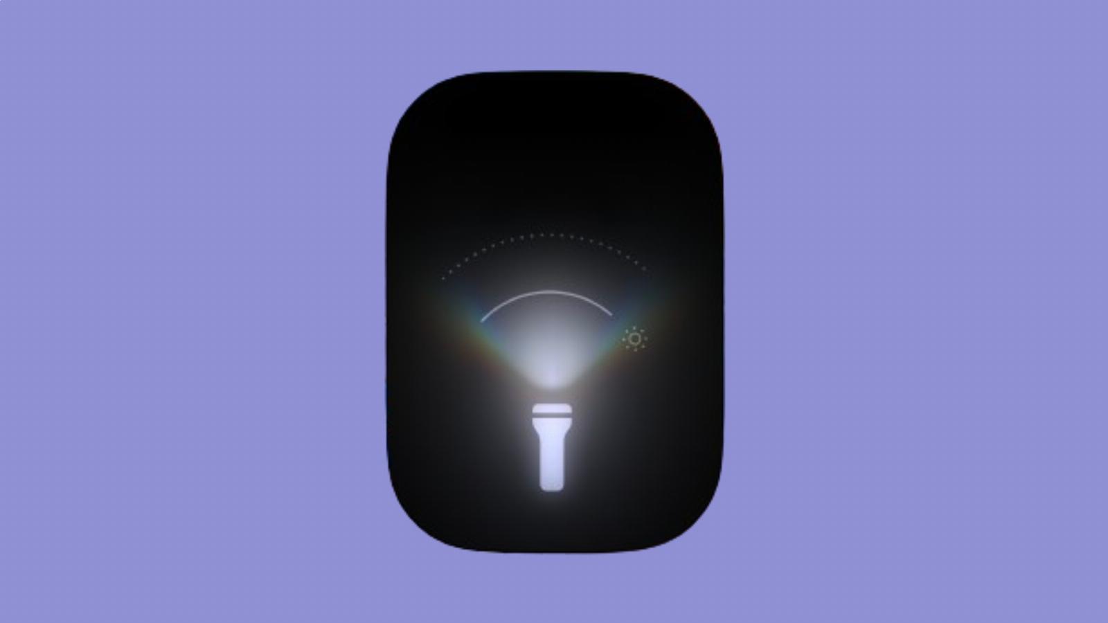
With the latest iOS 18 developer beta, Apple makes flashlight UI more fun
Reading Time: < 1 minutesApple released the third developer beta version of iOS 18 on Monday. While there are no major new features like Apple Intelligence in this update, there are some neat design changes. But the new UI for the flashlight takes the cake.
The company had already introduced a new way to control True Tone Flashlights on Pro iPhone 14 and 15 models. Unlike the previous controls of on/off and four levels of brightness, the new controls included variable brightness and a way to adjust the width of the beam. The controls in the first beta just had vertical and horizontal lines to represent them, and it took users a second to get accustomed to it.
However, with the iOS 18 developer beta 3, Apple has made the feature and design more amiable and simpler to use. The new design has a curved line to indicate both width of the beam and brightness. The UI also shows a dotted curved lineup top to indicate the peak intensity mark.
This is not a massive change, but it just makes for a fun design shift. As an added bonus, it also makes the flashlight more useful.
The third developer beta brings another design change, automatically converting third-party apps’ icons to a dark shade. Previously, only Apple’s native apps had new dark-tinted icons.
What’s more, the company has added a new dynamic wallpaper that changes colors based on the time of the day.
Ref: techcrunch
MediaDownloader.net -> Free Online Video Downloader, Download Any Video From YouTube, VK, Vimeo, Twitter, Twitch, Tumblr, Tiktok, Telegram, TED, Streamable, Soundcloud, Snapchat, Share, Rumble, Reddit, PuhuTV, Pinterest, Periscope, Ok.ru, MxTakatak, Mixcloud, Mashable, LinkedIn, Likee, Kwai, Izlesene, Instagram, Imgur, IMDB, Ifunny, Gaana, Flickr, Febspot, Facebook, ESPN, Douyin, Dailymotion, Buzzfeed, BluTV, Blogger, Bitchute, Bilibili, Bandcamp, Akıllı, 9GAG