All the New Ways to Use Your Apple Watch
Reading Time: 3 minutesIt’s like getting a new Apple Watch, but for free!
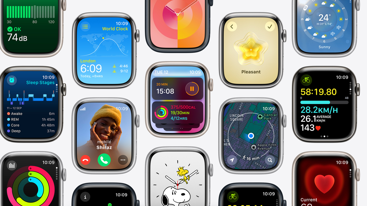
With watchOS 10, Apple breathed new life into the Apple Watch, without even changing the hardware design. Now, watchOS finally embraces buttons, and higher information density across the board. Most importantly, in my view, are widgets, which have the potential to change how you interact with your Apple Watch for the better.
Widgets are a game changer
Swipe or scroll up using the Digital Crown, and a whole new panel of scrollable widgets appear. By default, Apple adds a Smart Stack, a dynamic array of widgets that it thinks you’ll like. If you have a timer, workout, or music playing, the widget will show up here automatically. You can keep turning the Digital Crown to see more of these widgets, as well.
The real fun starts when you customize the widgets. Tap and hold the screen to enter the edit mode, then start by editing the triple shortcut widget. This will let you quickly open an app, or a feature within an app, so you can rock a minimal watch face, yet have quick access to an app like Workouts.
From here, you can tap the Plus button to add more widgets. Apple’s own widgets are great, but you’ll also find that large-size widgets from the watch face work well here, and there are many third-party developers who already support this feature. Tap Pin to keep a widget at the top of the list. Tap Done and you’re ready to go. Because it’s a Smart Stack, widgets will change order throughout the day, depending on the context and the time, but pinned widgets will always be at the top.
Control Center finds a new home
If swiping up on the screen reveals the widgets, how do you get to the Control Center? Well, the old Dock, which showed a list of recently used apps, is dead. (Long live the Dock.) Instead, pressing the Side button now opens the Control Center.
No fast face-swapping for you
The new design changes, and the new widgets framework, are welcome. But in making these changes, Apple disabled the old watch face switching gesture that we’ve come to know and love. You can no longer swipe in from the left or right edge of the screen to get to the next watch face in your list. Now, you need to tap and hold on the screen, and then swipe through, then tap again to select the watch face. We’ll survive this, but come on Apple: Bring this one back.
The app screen is now sensible
The Apple Watch came with an interesting honeycomb interface for displaying apps. All apps were spread away from the center, so you had to swipe across to find an app. If this layout didn’t work for you, you could choose to view your apps in an alphabetical list instead.
Now, the honeycomb app screen itself is now contained within the boundaries of the Apple Watch. You still get the same layout, but now you can scroll down to see more apps, and the apps remain in the same place! It’s a great change, and something you should try if you switched to List view long ago.
Better app design
Apple has a new design language for their own apps, and we hope third-party developers will follow suit. This new UI heavily utilizes background colors and large visuals in apps like Activity and Weather, adding many more pages to the interface. Plus, app now feature buttons all over the place. What was once hidden behind tap-and-hold menus is now available in the corners of the screen. The app screens themselves now display a lot more data. (The weather app’s new home screen is a great example of this change.)
Tap, but not the screen
If you have a brand-new Apple Watch Series 9 running watchOS 10.1, you get a whole new way of interacting with your wearable, and you don’t even need to tap on the screen.
Using the new chip in the Series 9 watch, Apple can now register when you do a simple double-tap gesture with your index finger and thumb, mapped with the primary interaction with what’s on the screen. For example, if a timer is finished, simply tapping your fingers twice will dismiss it. Now, older Apple Watches can also use this as part of an accessibility feature, but you need to set that up manually, and it doesn’t work quite like the official double-tap feature. Being an accessibility feature, it has a much larger scope, enabling options that make the Apple Watch easier to use for people with limited vision and motor abilities.
Reference: https://lifehacker.com/all-the-new-ways-to-use-your-apple-watch-1850984316
Ref: lifehacker
MediaDownloader.net -> Free Online Video Downloader, Download Any Video From YouTube, VK, Vimeo, Twitter, Twitch, Tumblr, Tiktok, Telegram, TED, Streamable, Soundcloud, Snapchat, Share, Rumble, Reddit, PuhuTV, Pinterest, Periscope, Ok.ru, MxTakatak, Mixcloud, Mashable, LinkedIn, Likee, Kwai, Izlesene, Instagram, Imgur, IMDB, Ifunny, Gaana, Flickr, Febspot, Facebook, ESPN, Douyin, Dailymotion, Buzzfeed, BluTV, Blogger, Bitchute, Bilibili, Bandcamp, Akıllı, 9GAG